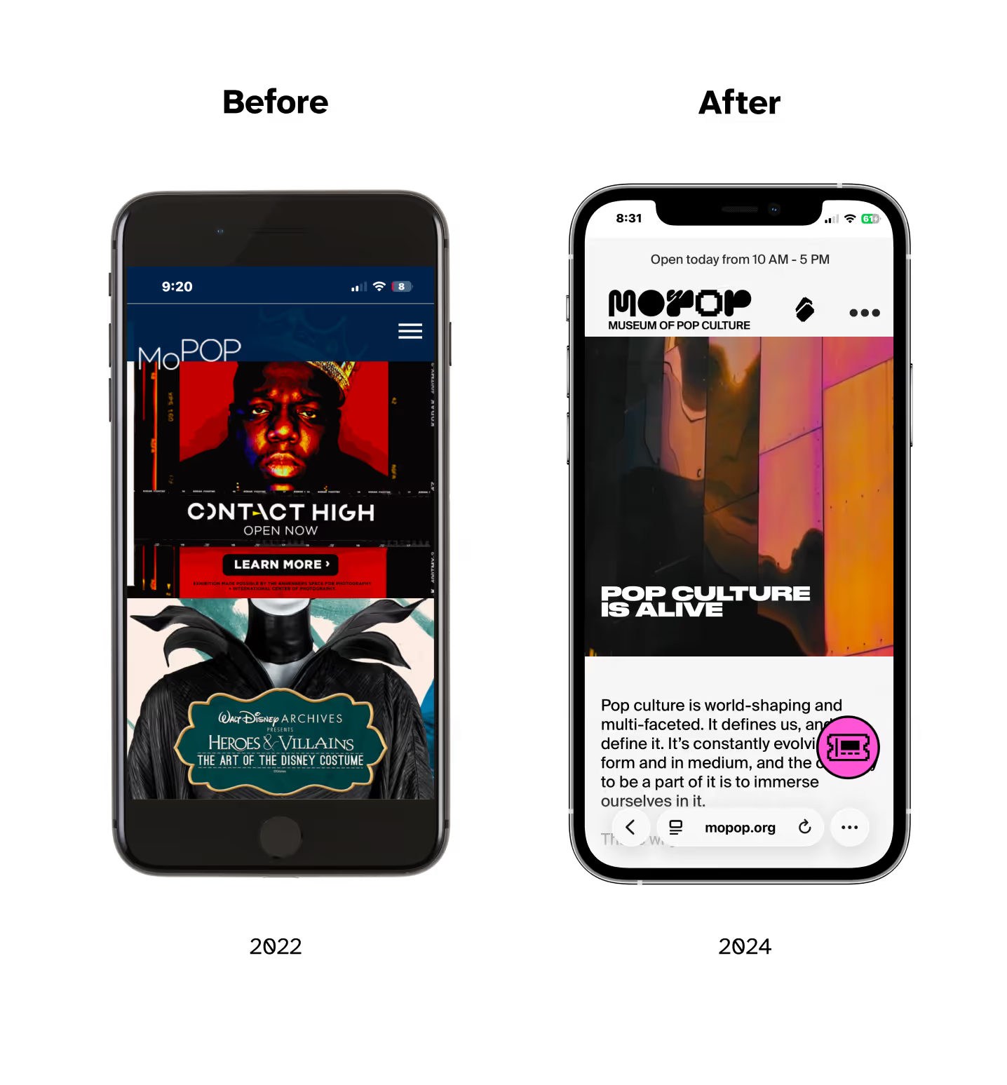
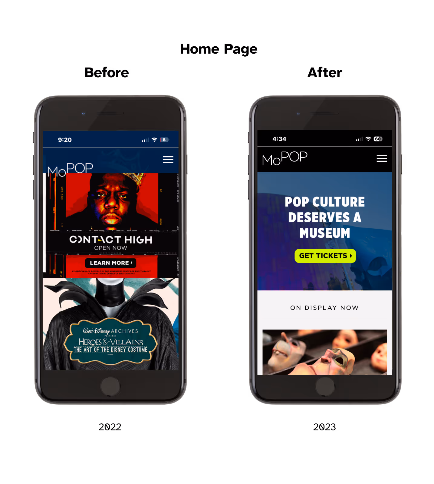
MOPOP Home Page GIF

Website redesign to increase museum ticket purchase conversion rate

Project type: Website design, front-end development
Role: UX researcher, UI designer, front-end developer
Industry: Museum, Arts/Entertainment

View MOPOP Website

Problem

The original MOPOP.org website was not optimized for mobile and lacked clear navigation and brand identity.

Solution

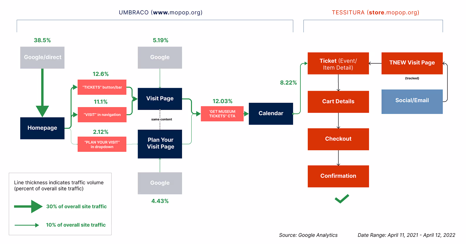
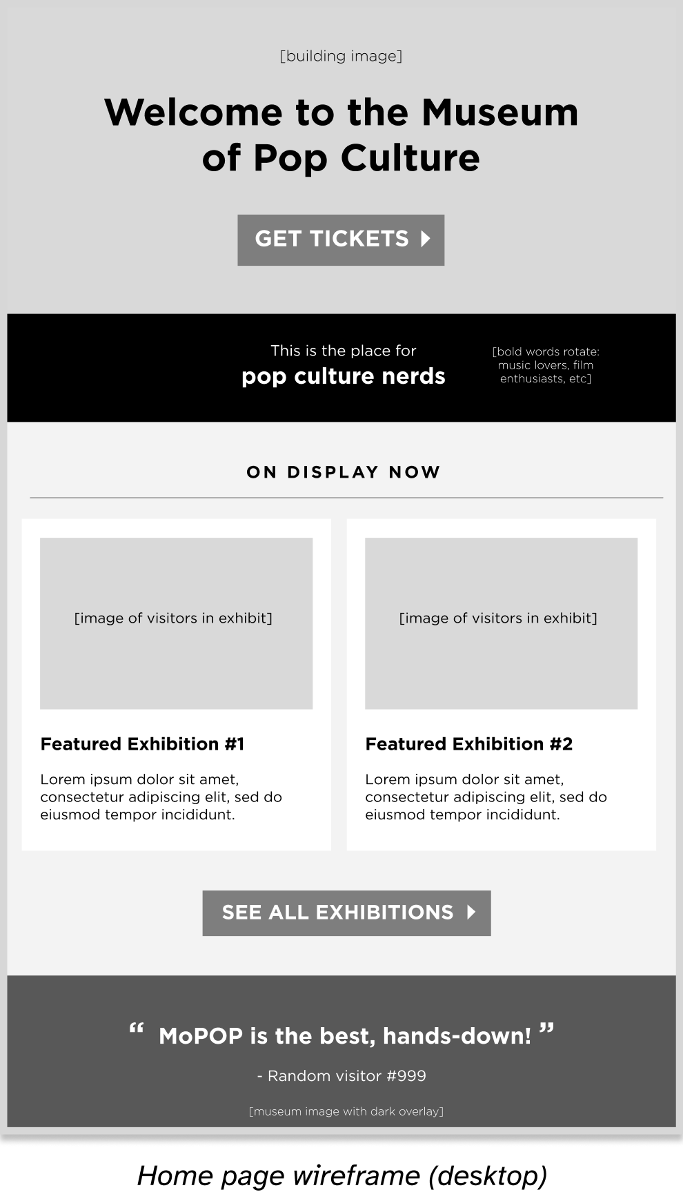
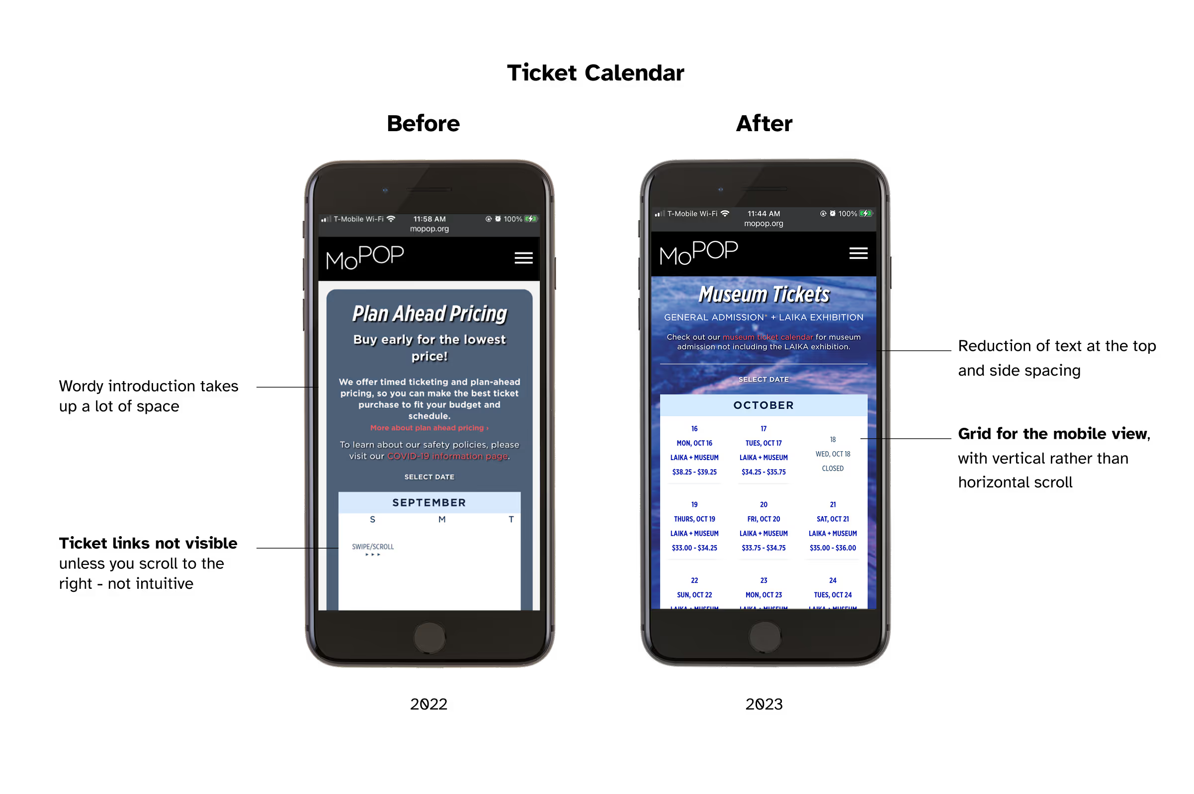
Based on research insights, I redesigned the museum ticket calendar and home page to optimize the experience for mobile users, resulting in an increase in engagement rate and web purchases.

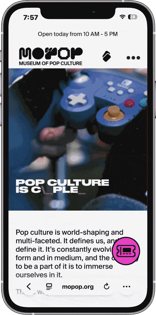
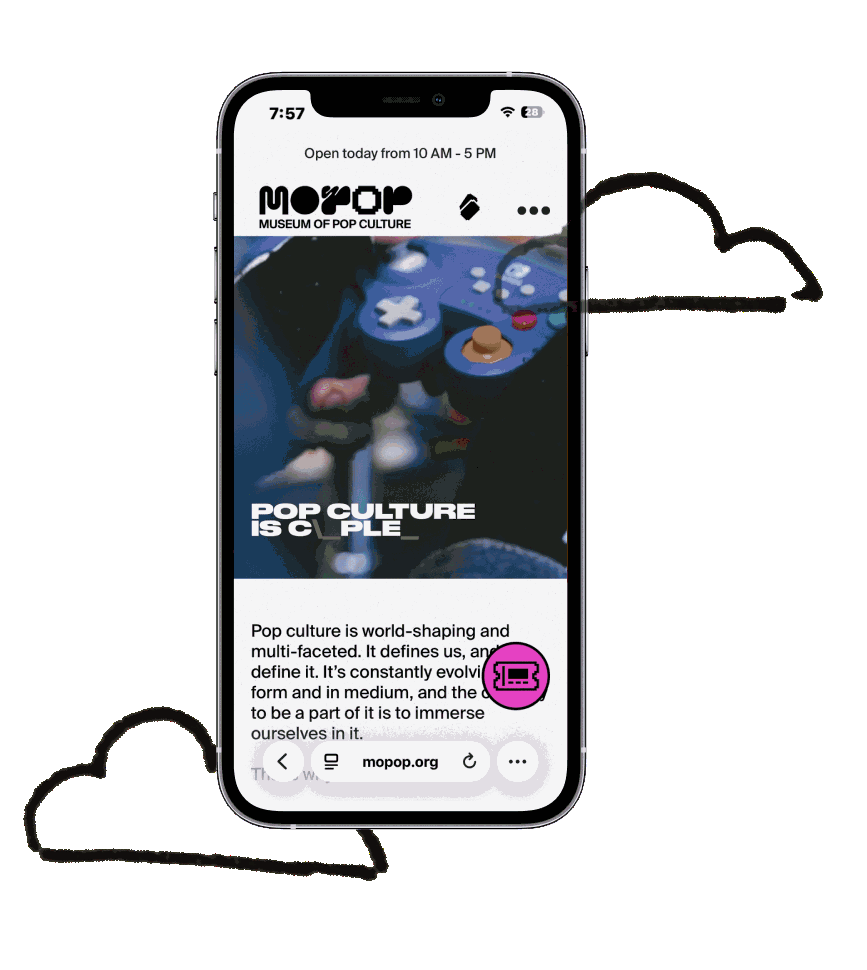
Building on this work, I worked with the MOPOP team to do a full website redesign, creating a more engaging and visually appealing experience.

MOPOP Home Page: Before and After

Part I: Google Analytics Research

Duration

Q2 2022, Q2 2023

Tools

Google Analytics, Figma

My Role

UX Researcher

What is the research goal?

Ticket purchases are MOPOP’s largest source of revenue, bringing in millions each year. In my research, I wanted to find out: how might we optimize the MOPOP website for ticket purchase conversion?

Where are people going on MOPOP.org?

I created a flowchart of the different website pages based on data in Google Analytics to understand how users were navigating the site.

Duration

Q2 2022, Q2 2023

Tools

Google Analytics

Figma

My Role

UX Researcher

Visit Path Flowchart of MOPOP.org

What I found out + what to do about it

Insight

Action Item

More than 70% of our users visit the site on a mobile device

Ensure key pages (like the Tickets page) are fully usable and legible on mobile

It takes 27 clicks to purchase tickets, starting from the home page without an existing account

Redesign the home page to get to the Tickets page faster

Customers are complaining!

Our box office would often field phone calls from confused visitors who couldn’t find the tickets for the latter half of the week, since those days would get cut off on the mobile view.

Part II: Partial Redesign

Duration

Q2 2023 - Q4 2023

Tools

Figma

Umbraco

My Role

UI Designer

Front-End Web Developer

The fun part - redesigning key pages

Based on my research, I set out to do a partial redesign of the site. I revamped two of our most-visited pages: the home page and the ticket calendar page.

I created wireframes for both desktop and mobile, keeping in mind that the mobile view was what the majority of our guests would see.

In the wireframing process, I focused on creating visual hierarchy with the organization’s goals in mind:

Duration

Q2 2023 - Q4 2023

Tools

Figma

Umbraco

My Role

UI Designer

Front-End Web Developer

Wireframe of the MOPOP home page after partial redesignWireframe of the MOPOP home page after partial redesign
  • “Get Tickets” call-to-action at the top to elevate main revenue driver + most common user goal
  • Featured exhibitions to show visual evidence of the value proposition of a MOPOP visit
  • Grid elements with white space stack on top of each other on a mobile view

How the redesign supports MOPOP's goals

Organizational Goal

Design Solution

Maximize purchase conversion rate of website visitors

Prioritize “Get Tickets” call-to-action in the visual hierarchy of the home page

Reduce friction and confusion in the ticket buying purchase path on mobile

Use a responsive, vertically scrolling grid that stacks on mobile

Portray the value and experience of a MOPOP visit in a clear format

Include in-museum photography in a consistent layout with more white space

How it turned out

Ticket Calendar: Before and After (Partial Redesign)MOPOP Ticket Calendar: Before and After (Partial Redesign)
  • Before:
    • Wordy introduction took up a lot of space
    • Ticket links were not visible unless you scrolled to the right - not intuitive
  • After:
    • Reduction of text at the top and side spacing
    • Grid for the mobile view, with vertical rather than horizontal scroll
Home Page: Before and After (Partial Redesign)MOPOP Home Page Redesign: Before and After (Partial Redesign)
  • Before:
    • No clear way to purchase museum tickets from the home page
    • Clashing art without negative space
  • After:
    • Neon green for the Tickets button signals clickability
    • Artifact photos with negative space display the in-museum experience

Results

6 weeks before vs. 6 weeks after redesign

Ticket Calendar Revamp: 10/4/23

Ticket calendar page engagement rate: +66.20%

53.07% → 88.20%

8/22/23-10/3/23 vs. 10/4/23-11/15/23

Our engagement rate on the ticket calendar page greatly increased after the ticket calendar revamp in October.

The website typically receives the most engagement during the summer. We did not see the usual seasonal decline, showing the effectiveness of these changes.

Home Page Revamp: 11/17/23

Home page engagement rate: +9.46%

75.66% → 82.82%

Ecommerce purchases: +15.61%

5,029 → 5,814

10/5/23-11/16/23 vs. 11/17/23-12/29/23

A month later, we implemented the home page revamp.

In the six weeks after the home page revamp, we saw a significant increase to a 82.82% engagement rate on the home page, and a 15.61% increase in web purchases.

Through this process, I learned that taking the initiative to identify UX problems to leadership could actually result in these issues being taken more seriously. I was delighted that soon after I presented this information to our CEO, she gave us the green light to redesign the website to be more modern and usable for our visitors.

Part III: Full Website Redesign

Duration

Q1 2024 - Q3 2024

Tools

Webflow

Tessitura

My Role

UX Researcher

Back-End System Administrator

Front-End Web Developer (Post-Redesign)

What I did

During this website overhaul process, I supported in the following tasks:

  • Defining goals and objectives for the new site
  • Conducting a content audit and SEO review
  • Integrating the systems connected to our site
  • Auditing and benchmarking performance goals
  • Gathering input from all MOPOP departments
  • Building the new site map and information architecture
  • Testing the site for quality assurance
  • Cleaning up errors post-launch

Though I played a crucial part in the project, it was a huge team effort from the MOPOP Marketing team, in collaboration with BStudio (now Duet).

Duration

Q1 2024 - Q3 2024

Tools

Webflow

Tessitura

My Role

UX Researcher

Back-End System Administrator

Front-End Web Developer (Post-Redesign)

Research

We had a tight time constraint of eight months for this full website redesign project. Still, knowing the importance of a solid research foundation, I advocated for qualitative research before diving into the site redesign.

Given the condensed timeline, we used two research methods: a general visitor survey*, and a listening tour to understand the website needs of all MOPOP departments.

Research Insight

Design Solution

Users found difficulty in using the highly nested top navigation bar

Simplify the navigation to have only two layers maximum

Some users found the visual design of the site to be unappealing

Implement a modern, bold, and impactful design that aligns with the museum’s new brand

Membership sales do best when a comprehensive list of member benefits is easy to find

Add member benefits list to the top of the membership page

*Note: Some survey responders got confused, giving feedback about the museum itself rather than the website

How it turned out

Our new website does a better job of reflecting the dynamic, beautiful, and ever-changing nature of the museum.Our new website does a better job of reflecting the dynamic, beautiful, and ever-changing nature of the museum.
  • Our new website does a better job of reflecting the dynamic, beautiful, and ever-changing nature of the museum.
  • Simplified site navigation is only 2 layers deep
  • We ensured that tickets are easy to find, and reduced the # of clicks to buy a ticket

Results

Comparison: 10 months post-revamp, YoY

Users

1,029,910 → 862,849

With the site redesign, we saw mixed results. Due to some impacts to SEO, we saw a 16.2% decrease in users when comparing year-over-year since site launch.

Memberships and Donations

2% → 5%
of total revenue

Still, it successfully increased memberships and donations, with the percent of online transactions consisting of these types of contributions increasing from 2% to 5% before and after the site revamp.

What I learned in the process

UX research is imperative to produce a thoughtful site redesign

A newer and prettier site doesn’t always equate to more sales

Design surveys carefully - wording can greatly impact on results!

Large scale site redesigns can have a major effect on SEO

Don’t rush the process - slow and steady wins the race

Accessibility audit

Although the site was designed with accessibility in mind, there were still many accessibility issues on the site. I led the web accessibility audit project, and taught the accessibility committee how to check for accessibility issues using the WCAG checklist.

Based on the audit results, I created a list of action items, emphasizing the fixes that can be implemented without completely restructuring the site, such as adding alt text to images.

Next steps

  • Revamp our museum visitor surveys
  • Conduct participant interviews to determine pain points on the new website
  • Analyze the past few years of survey results to synthesize actionable insights for the MOPOP team
  • Create a structure for feedback to flow in constantly to all departments, so that we can continually improve the customer experience journey

Thank you for reading!