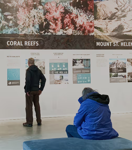
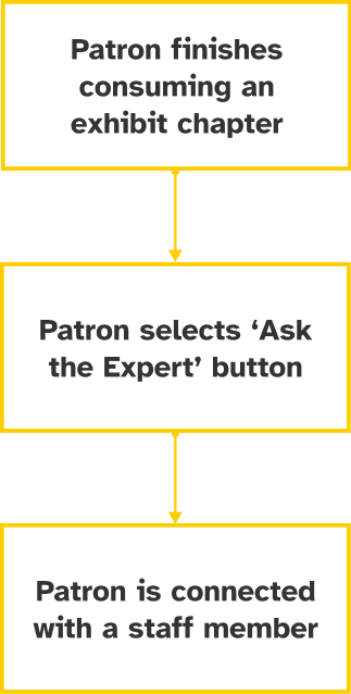
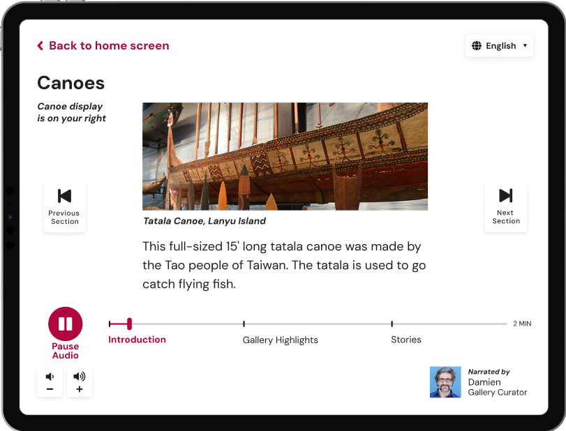
Burke Museum tablet interface prototype image

Providing digital accessibility for senior citizens at the museum

Project type: Tablet interface design
Role: UX researcher + UI designer
Industry: Museum, education

Watch Prototype Video

Providing digital accessibility for senior citizens at the museum

Project type: Tablet interface design
Role: UX researcher + UI designer
Industry: Cultural institution, education

View Prototype Video

Problem

Senior citizens encounter accessibility issues at the Burke Museum, such as small fonts that are hard to read, preventing them from engaging with museum content.
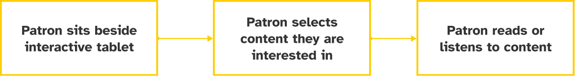
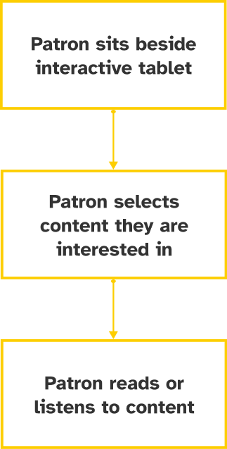
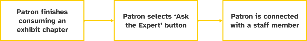
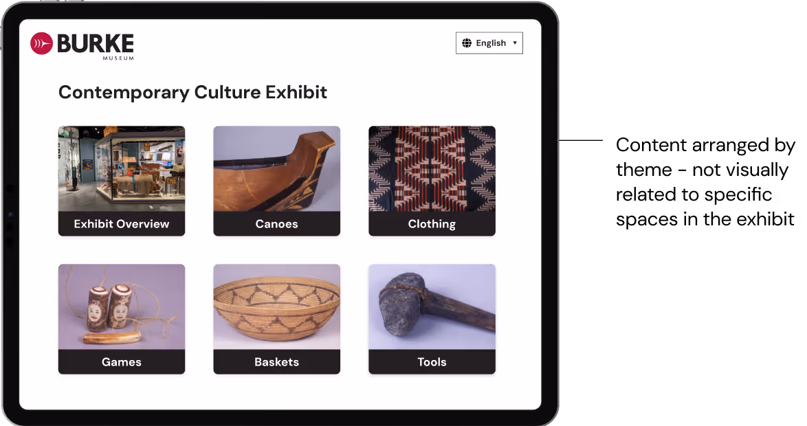
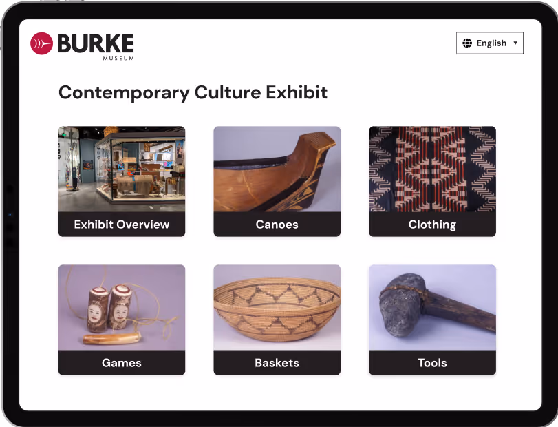
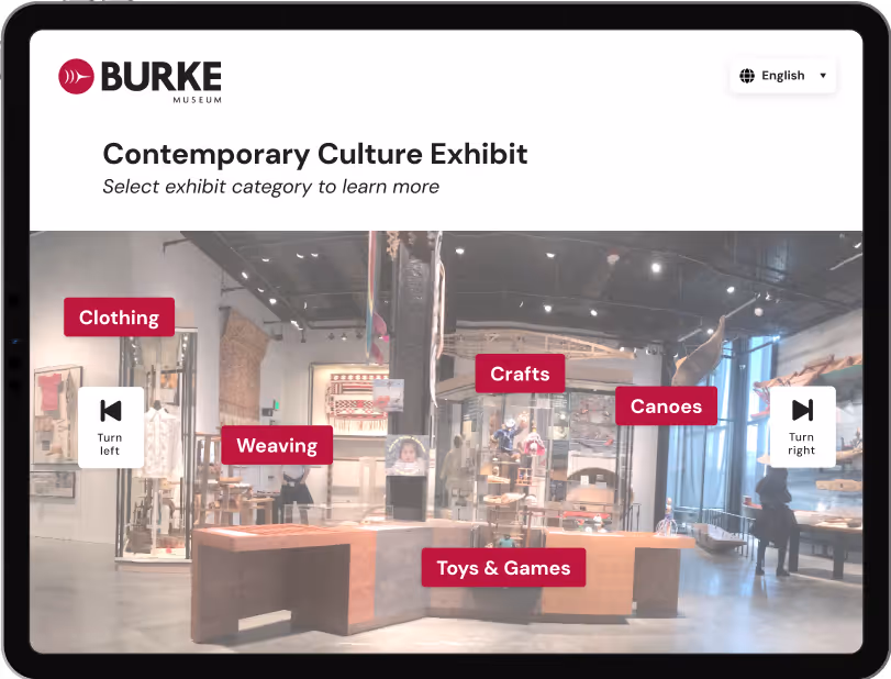
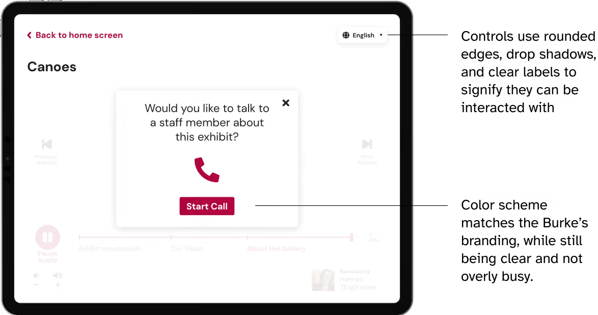
Solution

My team and I created a prototype for a tablet app for the Burke Museum that aims to create an accessible experience for senior citizens. We designed the app based on our insights from interviewing museum staff and patrons.

Project by Nadia Kaheil, Rachel DeNoble, Amixa Ray-Calzado, and Clara Yeung

Research

What I did

  • Conducted interviews of seniors at the museum
  • Performed comparative analysis and literature reviews
  • Synthesized research insights
  • Assisted in interface design and user testing

Duration

Q1 2020

Tools

Figma

My Role

UX Researcher

UI Designer

What we asked

Elderly visitors at the Burke museum, one standing and one sitting

We interviewed

6 patrons + 5 employees.

We asked patrons why they came, how often they come, and what they think about the Burke.

We asked employees about what they’ve observed about seniors interacting with the Burke and for other ideas around how accessibility at the Burke could be improved.

What we learned

Oh, the Field Museum is wonderful, you can get lost in there!”

Senior visitors enjoy the sense of exploration + interactive engagement with museum content that creates immersion in the experience.

My eyesight is going and some of the text is too small”

Seniors with vision impairments had trouble reading small type used on placards.

It’s nice that they are available to answer any questions”

Lastly, we learned that senior visitors enjoy conversing with the staff and learning from them personally.

Design Process

How might we

‍How might we better connect senior visitors with museum content without compromising comfort?‍


What form should our design solution take?

Initially, we wanted to make an AR walker to give seniors continual physical and informational support as they navigated the museum. However, through critique we realized that the combination of a screen and a walker would be too bulky and unfamiliar for seniors to use.

Our design solution of seated tablet stations utilizes a familiar kind of technology to allow seniors to rest and learn at the same time.

Mockup of interactive tablet with phone attachments next to bench seating at the Burke museum
Concept: placement of tablet interface at the Burke Museum

What we want to achieve

Design Principles

Support the Experience

We want to enhance rather than replace the exhibit. Technology should be an added value, not a distraction.

‍Provide a Comparable Experience‍‍

Instead of paring down the museum experience for the sake of accessibility, we want to provide an experience that is just as engaging and informative as the ‘normal’ experience.

Empathize & Reassure

The interface should be empathetic and reassuring, so as to not intimidate users who are unfamiliar with it, as seniors are less likely to understand modern tech conventions.

‍‍‍Prioritize Clarity

We want to minimize confusion and make things easy for elderly users.

How do seniors interact with the tablet?

Burke Interface Task Flow 1: Selecting contentBurke Interface Task Flow 1: Selecting content

Seniors choose from a list of content relevant to the exhibit they are in, which leads into an audio journey that guides them to look around them and learn more about what they are seeing.

Burke Interface Task Flow 2: Connecting with a staff memberBurke Interface Task Flow 2: Connecting with a staff member

The “Ask an Expert” option gives seniors a way to learn more about the exhibit in an interpersonal manner without having to get up and search for someone.

User testing: how it went in real life


During user testing, we noticed that the user was fully immersed in using the technology, rather than looking at or referencing the physical exhibit.

In order to facilitate a closer connection between the interface and the exhibit, we changed the home screen to map directly to the view of the exhibit itself.

Before user testing

Burke Interface before user testing. Content arranged by theme - not visually related to specific spaces in the exhibitBurke Interface before user testing. Content arranged by theme - not visually related to specific spaces in the exhibit
Content arranged by theme - not visually related to specific spaces in the exhibit

After user testing

Burke App interface after user testing. Use of photography to map content to where it is physically located in the exhibitBurke App interface after user testing. Use of photography to map content to where it is physically located in the exhibit
Use of photography to map content to where it is physically located in the exhibit

The Final Design

How it turned out

Burke App Interface: Audio GuideBurke App Interface: Audio Guide
We chose DM Sans as our typeface, as its large x-height improves readability for those with low vision
Burke App Interface: Option to talk to StaffBurke App Interface: Option to talk to Staff
Controls use rounded edges, drop shadows, and clear labels to signify they can be interacted with
Color scheme matches the Burke’s branding, while still being clear and not overly busy.

What I learned in the process

Every little detail can impact screen accessibility, so consider UI decisions carefully

Consider the physical context of where a device will be used

Accessible design doesn’t mean designing for everyone, but rather for a specific audience

Thank you for reading!